Thursday, May 11, 2017

Assignment 6

Part I


Part I is dedicated to determining the nature of a statement made by a news organization, and also to use the information provided to determine the crime rate given the percent of free lunches for an area. 

A local news organization went on the record saying that as the number of kids that get free lunches increases, so does the crime in an area. The data the news organization used in this claim was used to see how much water this statement holds. A regression analysis is run to determine the significance of the relationship between these two variables (Figure 1, and Figure 2). The results of these tests are below. The results from Figure 2 were then used to determine what the corresponding crime rate per 100,000 people would be given a 23.5% free lunch for an area.


Figure 1: R squared regression results.


Figure 2: Regression results for free lunch and crime percentage.


Y = a + bx

Y= Crime rate
a = Constant
b = PercentFreeLunch B Coefficient
x = Percent Free Lunch For an area

Crime Rate = 21.819 + 1.685(23.5)

    =61.4165 per 100,000 people

Due to the results of the regression, the news outlet can make a claim that there as the number of children with free lunches increases, so does the crime, however, this is a very shakey claim. The significance value of the results is p=.05, and the beta is .416, which means that there is barely a positive linear relationship between the two variables. On top of this, the r squared results is .173, which means that the Crime Rate only explains 17.3% of the number of free lunches distributed. This low of a number indicates that the model is very poor at explaining the variance of percent free lunches. These factors put together make it a very poor choice to indicate that as the percent of free lunches increases, so does the crime rate.


Part II


Key words for Part II:

Regression Analysis: A statistical tool used to investigate the relationship between two variables
Dependent Variable: What is explained by the other variables
Independent Variables: The variables which are used to analyze the dependent variable
Linear Relationship: Significant relationship exists between independent and dependent variables
R-Squared: Or coefficient of determination, is a number which represents the variance of the dependent from the independents included in the model
Residual: How far the observed value is from the theoretical value


Introduction


Part II is dedicated to analyze the factors which influence 911 calls throughout Portland, Oregon. The City of Portland is interested in assessing their efficiency in responding to 911 calls. To accomplish this, they want to see what factors can help to explain where the most calls come from. A company is also interested in building a new hospital, and this report will help to use the factors listed below to determine potential locations for building an ER.

The factors are:
911 Calls (Dependent Variable)
Jobs
Renters
Low Education (People with no high school degree)
Alcohol Sales (AlcoholX)
Unemployed
Foreign Born population
Median Income
College Grads

Methods


To determine results, the first step is to use regression analysis on a variety of variables to try to find significant linear relationships between the independent variables and 911 calls.  The three variables chosen were jobs, renters, and low education. This was due to a quick stepwise regression analysis to determine if there were three significant variables that were the result of that. The stepwise process is described later on in this report. Figures 1, 2, and 3 describe the results of this below.

The next step is to make two maps, one being a cholopleth map of the number of calls per census tract, and the other being a standardized residual map of the renters per census tract in Portland. The renters was the variable chosen because it has the highest r-squared value out of the three variables analyzed. The residual map is created in ArcMap using the Ordinary Least Squares (OLS) tool to create a shapefile of the renter residuals.

The third step of the report is to use a multiple regression report. This process uses all of the independent variables listed above. Collinearity Diagnostics are ran along with the multiple regression report to determine if there is multicollinearity present among the independent variables. After this is completed, a stepwise approach to help determine which variable is the most important. A final map is created using the three variables from the stepwise results in ArcMap with the OLS process.

Results


Figure 1 below displays the results of running a linear regression report using jobs as the independent variable against 911 calls as the dependent. Jobs displays a positive linear relationship with 911 calls. The p value is less than .05, and the beta is a .583 which is the basis of the claim. The r-squared is .34 which means that 34% of the 911 calls can be explained by jobs per census tract.


Figure 1: Regression results from jobs against 911 calls.


Figure 2 below displays the results of running a linear regression report using low education as the independent variable against 911 calls as the dependent. Low education displays a positive linear relationship with 911 calls. The p value is less than .05, and the beta is a .753 which is the basis of the claim. The r-squared is .567 which means that 56.7% of the 911 calls can be explained by jobs per census tract. This is higher than the amount of 911 calls explained by jobs per census tract.


Figure 2: Regression results from running low education against 911 calls.


Figure 3 below displays the results of running a linear regression report using renters per census tract as the independent variable against 911 calls as the dependent. Renters displays a positive linear relationship with 911 calls. The p value is less than .05, and the beta is a .785 which is the basis of the claim. The r-squared is .616 which means that 61.6% of the 911 calls can be explained by renters per census tract. This is higher than the amount of 911 calls explained by jobs per census tract, and low education. Renters per census tract displayed the highest r-squared value out of the three values ran in regression models against the dependent of 911 calls. This result helped to create a residual map of renters in Figure 5 below.


Figure 3: Regression results from running renters against 911 calls.


Figure 4 displays results of creating a chloropleth map out of 911 calls within Portland. This process creates a ranked order of census tracts comparing direct amounts of 911 calls throughout the city. The results help one see the tracts within the north central portion of the city receive the largest amount of 911 calls per tract. Using just this map, the small tract displaying 19-56 911 calls between 4 of the highest proportion could be the new location for the hospital.


Figure 4: Chloropleth map results of 911 calls throughout the census tracts of Portland, OR.


Figure 5 below displays a standardized view of the residuals of census tracts based on renters within the city. The darker the red displays the higher the proportion of renters making 911 calls, the darker the blue displays the lower proportion of renters making 911 calls.


Figure 5: Standard deviation map of residuals for renters in in Portland, OR against 911 calls.


Figure 6 below displays the results of running a multiple regression report with all of the variables along with a collinearity report to determine if there are any independent variables which are related and thus change the results of the multiple regression report. Using all of the variables, only jobs and low education display a linear relationship with 911 calls, and they both have positive linear relationship. Although this is true, the r-squared is .783 which means that 78.3% of the 911 calls are explained by the independent variables within the model.

Viewing the collinearity diagnostics, the condition index is less than 30, and therefore there is no multicollinearity. Although this is true, the low amount of independent variables that display a linear relationship with 911 calls suggests that the variables do tend to pull the trend line around without having too much significance on 911 calls.


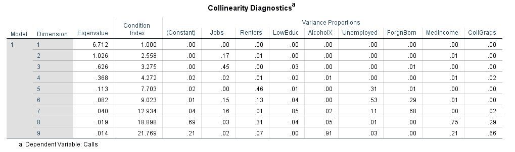
Figure 6: Multiple linear regression and collinearity results using all of the independents against the dependent.


Figure 7 displays the stepwise regression report using all of the independent variables. The three variables that were included in the report are renters, low education, and jobs. The three all display a positive linear relationship with 911 calls. The r-squared of the model with all three included is .771, which means that 77.1% of the 911 calls can be explained by these three independents together. This is only 12% smaller than the model with all of the variables included, and all three of the independents in the stepwise results all have a positive linear relationship. A spatial representation of this report is below in Figure 8.


Figure 7: Stepwise regression results from all of the variables.


Figure 8 below displays a standardized view of the residuals of census tracts based on the three stepwise results within the city. The darker the red displays the higher the proportion of 911 calls being explained by the variables and the darker the blue displays the lower proportion of the three variables making 911 calls. This result helps the hospital group pick a spot. The spot suggested earlier in the report based off of Figure 4 is still the spot that would be a good choice based off of the three strongest independents too.


Figure 8: Standard deviation map of the residuals of the stepwise regression results.


Conclusions

The City of Portland now knows that renters, jobs, and low education within its census tracts are the three strongest results of the models presented for explaining 911 calls. They can use this information to find how to best respond to 911 calls, and to help create community programs which can address at least jobs and low education within the city. Although multicollinearity was not present, the results suggest that the combination of all of the independent variables is too much, and can sway the r-squared in a positive direction. Assignment 6 shows that SPSS and ArcMap can create highly accurate results that give users real information to create dynamic change within cities across the country. 

Tuesday, May 2, 2017

Assignment 5

Goals and Background


This assignment is designed to assist in the understanding of correlation through the use of various software. Students begin with the task of running correlations through IBM SPSS. With the output created from this process, they are then expected to interpret the correlations and determine significance of relationships. The next task is set up to have students download U.S. Census data, use the GEOIDs to join it within ArcMap, and then to run the joined data through Geoda to view Moran's I values and create LISA cluster maps.


Part 1


Part 1's goal is to use census data for Milwaukee, WI to find correlation values between various datasets. Correlation is a measure of how strong of a relationship exists between two variables. The results vary from -1 to 1, and the closer to either end of the spectrum indicates stronger relationships. Positive relationships are the result of  both datasets increasing together, and negative relationships are the opposite. The correlation results do not imply causation, however. 

The provided codes are the datasets in Figure 1 below:


White  = White Pop. for the Census Tracts in Milwaukee County
Black = Black Pop
Hispanic = Hispanic Pop
MedInc = Median Household Income
Manu = Number of Manufacturing Employees
Retail = Number of Retail Employees
Finance = Number of Finance Employees


Figure 1: Bivariate correlation matrix results from provided excel datasheet. 


One of the most apparent results of the matrix is from the White population having jobs in each industry, and the tendency for other races to not have as many jobs. Aside from the the correlation values comparing the white data against other races, the Pearson Correlation value is very strongly positive for the white data on all of the employee data. These results point towards white populations having more jobs in manufacturing, retail, and finance compared to black populations and Hispanic populations. This claim is supported by the results from the Pearson Correlation comparing the race's median income as well. 58.5% of the white population's income is explained by the correlation results on all of the data, while the black and Hispanic correlations are both negative values. This suggests that the white population's median income trends upwards with the trend line, and the other race's incomes are far lower than white populations. In other words there is a negative relationship between the black and Hispanic workers and median income.

Part 2


Introduction


The following work is dedicated to a project for the Texas Election Commission (TEC). The goal is to analyze the patterns of elections to determine if there is spatial auto correlation of voting patterns, and voter turnout in The State of Texas. Spatial autocorrelation is the study of how alike things arecompared to what is around it. When models are run, a value is returned that displays a strength of similarity the data set exhibits on a spatial scale. Unlike correlation, a positive or negative value does not give direction. The study is focused on the voting results for the Presidential Elections of 1980 and 2016. The data obtained is focused on the percent Democrat votes, and the voter turnout for each year. Ultimately, the results of this study will be provided to the Governor to see if election patterns have changed over the course of the 36 years between the two Presidential Elections.

Methodology


The provided data table from the TEC contains multiple code as follows:

  • VTP80 = Voter Turnout 1980
  • VTP16 = Voter Turnout 2016
  • PRES80D = % Democratic Vote 1980
  • PRES16D = % Democratic Vote 2016

The Hispanic Population of 2015 was necessary to obtain for the completion of the study. It was gathered from the 2015 US Census Bureau ACS 5 Year Estimates. The Texas County shapefile was also obtained from the US Census Bureau.

Once the data downloaded from the Census Bureau, it was cleaned up by deleting unnecessary columns and fields. After this was completed, it was brought into ArcMap along with the Texas Voting Data from the TEC, and the Texas County shapefile. All three of these data sets were joined on the GEOID provided through the US Census Bureau. This joined dataset was then exported into a new shapefile so that it could be used later.


The new shapefile was then brought into Geoda for further analyzing. A new project was created, and within this a spatial weight was developed to assist in determining spatial autocorrelation later. Once this was done, Moran's I plots were created using the weight against the variables. This helped to see if spatial autocorrelation was a factor in the elections. Similareto correlation coefficients, the Morans I returns a value between -1 and 1, with stronger values on the extreme ends of the spectrum. The higher the value, the higher the spatial autocorrelation, and the lower the value, the less the spatial autocorrelation. After these plots were created, LISA Cluster Maps were created for each data set for further analysis in spatial autocorrelation. These all helped in determining the strength of spatial autocorrelation between counties. 

Results


Percent Hispanic


The first data set ran through the Geoda Moran's I and LISA Cluster maps was the Percent Hispanic residents. The Moran's I exhibits very strong spatial autocorrelation results, with a score of .78 (Figure 2). This can be seen in Figure 3 in the LISA Cluster Map as well. The southern border of Texas exhibits High, High values almost all the way across, multiple counties in. This means that these counties all have areas of high Hispanic Populations surrounded by other areas of Hispanic Populations. This can also be seen on the opposite end of the spectrum, with the North East side of the state exhibiting Low, Low values. This means that these counties all have very low Hispanic populations, and are surrounded by other counties with very low populations.


Figure 2: Moran's I scatterplot of Hispanic populations in Texas counties.

Figure 3: LISA Cluster Map of Hispanic populations spread across the counties in The State of Texas.


Voter Turnout for 1980 Presidential Election


The next set of data to analyze was the voter turnout for the 1980 Presidential Election. The Moran's I is a medium strength value of .47 of spatial autocorrelation (Figure 2). This means that there is a strength that exists in the spatial autocorrelation of the data set, but it is not particularly strong. When looking at the LISA Cluster Map, this is visible in just a few areas around the state. The southern and eastern blue portions exhibit Low, Low values, which means that this is an area which exhibits low voter turnouts in the counties highlighted as well as the surrounding counties (Figure 3). The Northern part of the state, highlighted in red, exhibits High, High values, which means that these areas all have very high voter turnout compared to other areas in the state.


Figure 4: Moran's I scatterplot of voter turnout for the 1980 Presidential Election in Texas counties.


Figure 3: LISA Cluster Map of voter turnout for the 1980 Presidential Election spread across the counties in The State of Texas.


Voter Turnout For the 2016 Presidential Election


The Moran's I for the 2016 Presidential Election voter turnout is lower than the spatial autocorrelation for voter turnout in 1980. With a Moran's I value of .29, the spatial autocrrelation is pretty low for this data set (Figure 4) . This can mean that voters and non-voters are more evenly spread out than the election in 1980. This election, only the southern tip and a North Western portion of the state exhibits Low, Low values, and there is only a small area within the center of the state which has High, High values (Figure 5) . This finding would support the claim that there is more evenly spread out voters to non-voters as much less of the state is covered by extremes on the LISA map.


Figure 4: Moran's I scatterplot of voter turnout for the 2016 Presidential Election in Texas counties.


Figure 5: LISA Cluster Map of voter turnout for the 2016 Presidential Election spread across the counties in The State of Texas.


Percent Democrat Vote in 1980


The Moran's I value for democratic vote in the 1980 was relatively strong, with a score of .58 (Figure 6). This means that there is a fair amount of spatial autocorrelation between counties in Texas that voted Democrat. Comparing the LISA Cluster Map (Figure 7) to the voter turnout LISA map for 1980 (Figure 3), one can see similarities. The South Eastern High, High section of Figure 7, is the same area where there was Low, Low voter turnout in 1980. The same can be said for the Low, Low section of Figure 7, as it is almost the same area of the High, High turnout in 1980 (Figure 3). 


Figure 6: Moran's I scatterplot of percent democrat vote in 1980 within Texas counties.


Figure 7: LISA Cluster Map of percent democratic vote for the 1980 Presidential Election spread across the counties in The State of Texas.


Percent Democrat Vote in 2016


The Moran's I value of percent Democrat becomes higher in 2016 compared to 1980, with a score of .69 (Figure 8). This indicates a high amount of spatial autocorrelation for the party lines of the Presidential Election of 2016. Looking at the LISA map, one can see that there is a larger area of High, High Democrat voters along the southern edge of the state (Figure 9). Looking back at Figure 3, one can see that this area also has High, High Hispanic populations. One could assume that there was a larger Hispanic voter turnout this year than there was in 1980. 


Figure 8: Moran's I scatterplot of percent democrat vote in 2016 within Texas counties.


Figure 7: LISA Cluster Map of percent democratic vote for the 2016 Presidential Election spread across the counties in The State of Texas.


Conclusion


Part 1 allows one to see that SPSS is a very robust statistics software that allows user to gather fast, accurate results. Part 2 helps to see that using data from a variety of sources, one can aggregate it into a single file and find very compelling results within Geoda. There was not very strong evidence for voter turnout difference between 1980 and 2016, however there is evidence that there could have been a stronger Hispanic voter turnout in the South West portion of the state in 2016.


Wednesday, April 5, 2017

Assignment 4

Introduction


This assignment is intended to help gain an understanding of z and t tests more thoroughly. It dos this by utilizing real-world data connecting stats and geography. The first step to this is to distinguish between a z test or a t test for any given set of data. After this, the assignment is focused on calculating both z and t tests. The next portion of the assignment is dedicated to using the steps of hypothesis testing. These are:

1. State the null hypothesis

2. State the alternative hypothesis

3. Choose the statistical test to analyze the data

4. Choose Î± or also known as the critical value

5. Calculate the test statistic

6. Make decision about the null and alternative hypothesis


Part 1: Z & T Tests


Question 1


Part 1's task is to fill out a  half filled table's critical value, choose whether or not the item needs a z or t test, and to calculate the z/t value of the item (Figure 1).


Figure 1: Part 1's table filled out in completeness.


Question 2


Question 2 asks one to determine how the agricultural yields in a certain district in Kenya compare to the rest of the county.  The three crops and the per hectare averages of the country are: groundnuts, .57; cassava, 3.7; and beans, .29. The null hypothesis is that the per hectare averages of the three crops within this district will be no different than the country's averages. The alternative hypothesis is that there are differences between the districts per hectare averages and the country's.

A t test will be utilized in this study, because there are only twenty-three samples from farmers included (Figure 2). If there were more than thirty samples, than a z test would be utilized.


Figure 2: Test used to calculate t score and z score.

t= t score value
μ= sample mean
μh= hypothesized mean
σ= standard deviation of sample
n= number of samples

T Values
ground nuts= -.799
cassava= -2.558
beans= 1.998


The given information provided lists the confidence level at 95%, and that each test will be two tailed. Because it is a two tailed test, the probability will be halved to accommodate values at either end of a distribution. This means the critical value is collected from 97.5% rather than 95%. The degree of freed (df) is 22 (23 samples - 1). 

critical values= 2.074, -2.074

With this knowledge conclusions on the hypothesis can be made.

Ground nuts= Fail to reject null hypothesis
    The t value of ground nuts, -.799, falls within the critical value of the data set and therefore it must fail to be rejected. 

Cassava= Reject the null hypothesis
    The t value of cassava, -2.558, falls outside of the critical value range, and therefore must be rejected.

Beans= Fail to reject the null hypothesis
    The t value of beans, 1.998, falls within the critical value range and therefore it must fail to be rejected.


Probabilities

Ground Nuts: 21.66%
Cassava: 1.07%
Beans: 97.03%


Question 3


Question 3 asks one to come to conclusions on a stream's pollutants levels using hypothesis testing. A researcher is worried that the level may be higher than the allowable limit of 4.2 mg/l. It is a one tailed test with a 95% significance level.

Given Information

n=17
μ= 6.4 mg/l
μh=4.1 mg/l
σ= 4.4

The null hypothesis is that there is no statistical difference between the stream's pollutant level and the allowable limit. The alternative hypothesis is that there is statistical difference between the stream's pollutants levels and the allowable values. A t test will be utilized as there are less than thirty samples.

Critical Value=1.746
t=2.155

The t value falls far outside of the critical values, and therefore the null hypothesis is rejected

Probability= 97.86%


Part 2

Part 2 is dedicated to determining if there is a significant difference in the average home value between the houses within the City of Eau Claire block groups, and the block groups for the County of Eau Claire. 

Null Hypothesis: There is no significant difference between the average home values in the City of Eau Claire compared to the County of Eau Claire.

Alternative Hypothesis: There is significant difference between the average home values in the City of Eau Claire compared to the County of Eau Claire.

Statistical Test:  A Z test will be used because there are greater then 30 samples.

The variables in the formula from figure 2 were found in the attribute table from the provided shapefiles. When the variables are ran through the formula, a test statistic of -2.572 is found. The confidence level is 95%, and the test employed is a one tailed test. The critical value is determined to be -1.64. This was done in question one of part one. The test statistic is lower than the critical value, so I reject the null hypothesis. This means there is a significant difference between the average home values of the block groups of the City of Eau Claire and the block groups of the County of Eau Claire. The probability of this is .51%, which means that only .51% of the data set is less the the City of Eau Claire's block groups data. That's a very small amount. Figure 3 displays this information in maps below.


Figure 3: Maps depicting the average house values by block group in Eau Claire County and City of Eau Claire.

The maps above show the information discussed in this blog post. As one can see, there are many more high value average block groups south of the City of Eau Claire within the County. This further supports the rejection of the null hypothesis and states that the averages of the City of Eau Claire's block group house value averages are statistically different than the block groups of the County of Eau Claire.


Tuesday, March 7, 2017

Assignment 3

Introduction

This report will address the increase in foreclosures in Dane County, Wisconsin over the 2011-2012 time period. The results will confront the concern that more foreclosures will occur in 2013 by creating probabilities of the scenario.The reasons behind the increase cannot be determined with the data included, but this study will analyze the spatial patterns of the foreclosures to understand the likelihood that foreclosures will increase in 2013. 

Methods

This study utilized z scores, which standardize the foreclosure data, to analyze the spatial differences between foreclosures in different census tracts. The z score takes takes an observation, subtracts the mean from it, and then divides that value by the standard deviation. This value gives readers an idea how far each observation is from the mean. These values can be placed on a normal distribution curve. Using a z score chart allows the user to find probabilities of any occurrence (Figure 1). The z-scores collected on foreclosures in 2011-2012 are used in this manner to analyze the probability that census tracts will exceed the mean. The data will also be used to view the probability that foreclosures in all of Dane County will be exceeded 70% of the time in 2013, and the probability that foreclosures in Dane County will be exceeded only 20% of the time. 


Page 1
Figure 1: Complete table of z-score statistics and their probability of occurring. 


The census tract data is obtained through the US Census Bureau, and the foreclosure data has been collected and geocoded independently. The census tracts chosen to study within Dane County are 122.01, 31, and 114.01. Using ArcMap, the mean and stand deviations are collected to use in this study to analyze the results.


Table 1 shows the foreclosure counts for the chosen counties within this study.

 Census Tract
 2011 Count
2012 Count 
 122.01
 31
24 
18 
 114.01
32 
39 
Table 1: Foreclosure counts for the study area within Dane County.


2011 Mean: 11.39
2011 Standard Deviation: 8.776
2012 Mean: 12.299
2012 Standard Deviation: 9.906

Figure 2 shows the study area of Dane County within Wisconsin.


Figure 2: Image highlighting Dane County in Blue.


Results


Table 2 displays the calculated z scores and probabilities for each census tract. 


Census Tract
2011
 Z Score
2011 Probability
 2012 Z Score
2012 Probability
 122.01
 -.61
 72.57
-.64
 73.89
 31
 1.44
 92.51
.58 
 71.9
 114.01
 2.35
 99.06
2.7 
 99.65
Table 2: Z scores and probabilities calculated using Figure 1.


Figure 1 shows that for a 70% exceeded likelihood, the z-score would have to equal -.52.

-.52= (Xi-12.299)/9.906

(9.906*-.52)+12.999= Xi

Xi=7.85

The value of 7.85 means that there is a 70% chance that Dane County will have observations of 7.85 foreclosures or greater across each census tract. This seems to be the most realistic outlook


Figure 1 shows that for a 20% exceed likelihood, the z-score would have to equal .84.

.84= (Xi-12.299)/9.906

(.84*9.906)+12.299=Xi

Xi=20.62


The value of 20.62 means that there is a 20% chance that Dane County will have observations of 20.62 foreclosures or greater across each census tract.


Figure 3 illustrates the change in foreclosures from 2011-2012. The results were then converted to z scores to illustrate a diverging theme very clearly. Negative values indicate higher change in 2012. On can see that there are more extreme negative values (<-2.5) when looking at the map then extreme higher values (>2.5) throughout the country. Another observation that can be made is that it appears that there is more blue tract area than red tract throughout the country. Other data was needed to analyze this further.

Figure 3: Change map showing the difference in home foreclosures from 2011-2012. The data is normalized into z-scores to display a diverging scheme clearly.


Figure 4 displays the statistics of the new field which calculates the difference between the 2011 and 2012 foreclosures. The key statistic in Figure 4 is the mean, -.906. Like Figure 3, a negative value means that there was growth in foreclosures in the county. Having a negative mean means that there is a trend upwards in the amount of foreclosures.

Figure 4: This image displays the statistics and graph describing the difference between 2011-2012 field. 

Conclusion


This is an issue that must be addressed. There is a trend upwards in the amount of foreclosures from 2011-2012. This can have massive implications for the community if the amount of foreclosures continues to climb. A possible solution would be to offer tax credits for struggling homeowners to help curb the rise in foreclosures. The next study should be focused on the factors which cause higher foreclosures. 


Monday, February 20, 2017

Assignment 2

Part 1: Cycle Fever


The TOUR de GEOGRAPHIA is fast approaching, and I've got the need for speed. Team ASTANA(TA) is the safe bet to invest in, constantly churning out race winners year after year; however, Team TOBLER(TT) has been quietly making a name for themselves. The following statistics will help to determine the choice to invest in this year.

Range

The range is the difference between the highest and lowest value of each sample size. The range for TA is one hour and ten minutes, while the range for TT is thirty minutes. This shows TA has a few outliers which cause the range to look inflated, while TT still remains as a pack with a relatively small range.

Mean

The mean is the sum of all values, divided by the number of records per sample. TA has a mean of thirty-seven hours and fifty seven minutes. TT has a mean of thirty-eight hours and five minutes. 

Median

The median is the middle point of the values. It has the same number of records higher than it, and lower than it. The median for TA is thirty-eight hours exactly, while TT's median is thirty-eight hours and nine minutes.

Mode

The mode is the value that is most often repeated in the data. TA's mode is thirty-eight hours, and TT's mode is thirty-eight hours and nine minutes.

Kurtosis

Kurtosis is the height comparison of the graph to the normal or gaussian curve. A negative kurtosis is a value less than 1. This means that the peak will be flatter than normal and the data is more spread out. A positive kurtosis is greater than one and means that the peak is higher than the normal and there are more observations closer to the mean. TA's kurtosis is 1.17, while TT's is 2.93.

Skewness

Skewness is the distribution of how the curve of a dataset compares to the normal symmetry. A value of zero means there is no skewness and the curve will look normal. A positive number means that the curve is skewed to the left of the normal curve. A negative number means that the curve is skewed to the right of a normal curve. TA's skewness is -.0026, and TT's skewness is -1.56.

Standard Deviation

Standard deviation is an attempt to discuss the distribution of how observations are clustered around the mean. A standard deviation below one says that the data falls within thirty-four percent of either side of the mean. A standard deviation below 2 describes the data within forty-seven and a half percent of either side of the mean. A standard deviation below 3 explains ninety-nine percent of all observations. TA's standard deviation is 17.49, and TT's is 7.78. (Work is below in figure 1).


Investing

Due to all of the stats, it appears that the teams will exhibit tendencies close to what was predicted. Team ASTANA will produce a relatively average team with a skewness close to zero and a kurtosis very close to one. The range suggests that they will have very low minimum times, indicating a possible individual winner. Team TOBLER will produce a team with a skewness of -1.56 suggesting that they will have a majority of values above the mean, with a high kurtosis to suggest that their values will be clustered around the mean. This would make me think that the team will have times higher than the mean, and will be clustered around there.

All of these statistics make me inclined to invest in Team ASTANA, as they appear to have very high performing individuals, and their team statistics suggest that their team performs better than Team TOBLER. These statistics make me think that I will get a higher return on both the individual winner and the team funds.


Figure 1: Hand work done on standard deviation.

Part 2: Wisconsin's Center


Figure 2: Map depicting geographic mean center, and weighted population centers of 2000 and 2015.


This map places the geographic mean center of the state in the center. It also places a population weighted center for the years of 2000 and 2015 on the map. One possible explanation for the movement of the weighted population center is the loss of population in the Madison, and Milwaukee areas. This would help to explain why the point moves NW from the cities in 2015 as they lost population weight.

Wednesday, February 1, 2017

Assignment 1

Part I: Data Types

Nominal Data

Nominal data is all based on the name. Things such as state name, FID, or any other unique identifier is what the data classification method is based off of. 

Figure 1: Map of all of the Counties Within Wisconsin.


Figure 1 (1) above shows all of the counties in Wisconsin. The data is based on the county names, and separates the data based off of each county's name.

Ordinal Data

Ordinal data is any data that is ranked in any certain way. Things such as grade level (1-12), hurricanes (1-5), and many others all follow this method. If the data can be ranked, it is ordinal.

Figure 2: Ordinal data displayed across the World shows the rank of concern due to acts that violate various norms.

Figure 2 (2) shows ordinal data in the form of varying degrees of violations of political, economical, and use force norms across the countries of the world. It is ordered based on the counts of violations, displayed in darker shades of red as the number of violations gets higher.

Interval Data

Interval data is all the relationship of distance from one variable to another with no true set zero. It does not rely on a set scale, and can be used for multiple variables. Things such as temperature have no set scale of measurement. Some countries used Celsius, some use Fahrenheit. It is all about the relationship of the distance of measurement in interval data.

Figure 3: The map above displays temperature values for different regions across the U.S. in Fahrenheit. 
Figure 3 (3) shows the varying temperatures across the conterminous United States. The data scale is all set on the Fahrenheit temperature scale, which measures things differently than Celsius.

Ratio Data

Ratio data is very similar to interval data, except that it has a set zero for measurement. Some examples of ratio data weight and height. They both have a set zero starting point, and then can only get bigger from there. A common example is percentages. Things can't get less than 0%, or larger than 100%. Figure 4 shows this clearly (4).

Figure 4: The map above shows the influence humans have had on the natural land in the United States. It measures things in terms of how much natural land is left untouched.

Part II: 

    An important facet of a well functioning society is gender equality. With gender equality comes more opportunities for every member of the society, and thus create more economic stimulus for the economy as a whole. In Wisconsin, there are over 7,100 farms where the primary operator is a female. This is a good step, but there is much work to be done to ensure the state as a whole becomes much more balanced in terms of women's rights, and educating women to help them become principle operators of a farm themselves if they wish.

    The first map in the series is created using equal interval breaks. This creates evenly spaced groups and allows the viewer to see a general overview of the spread of the data throughout the entire range. When looking at this map, one can see that both the central sands region of the state and the northern portion of the state have the fewest number of principle female farmers. This makes sense, because of the sandy soil, and forested areas; however, the central portion of the state holds massive potential for principle female farmers.

Figure 5: Map of principle female farmers in the state of Wisconsin by county.
The red outline displays the developing study area.


    The next map is done using the natural breaks method. This creates the five most "natural" breaks throughout the data to create groups that are inherently displayed within the data already, counties for this map. This map shows that the central region of Wisconsin shows tremendous opportunity for growth among principle women farmers. The counties selected have surrounding counties that have high populations of principle female farmers, so as soon as the program would be initiated, the communities would rally around it and become stronger in the process.

Figure 6: Map of principle female farmers in the state of Wisconsin using the natural breaks method. The red outline displays the developing study area.


    The final map further illustrates the point made by the last map. It was created by classifying the data so that each grouping had the same amount of features. This further narrows the search for an area to begin our work to the smaller 6 county region in central Wisconsin. It shows that there's an "island" of counties that don't have the same amount of principle female farmers as the ones around them. 
    These 6 counties should be the base of our work, and if successful we can move west and try to increase awareness from the study area to the Mississippi River too.

Figure 7: The map above displays the principle female farmers with a quantitative classification. The red outline displays the starting study area.


Citations


1) https://www.presentationmall.com/wp-content/uploads/wi-multicolor.jpg
2) http://vmrhudson.org/SOCIC07color.jpg
3) http://www.smu.edu/-/media/Site/Dedman/Academics/Programs/Geothermal-Lab/Graphics/TemperatureMaps/surfacetemp.ashx?la=en

Data: https://www.agcensus.usda.gov/Publications/2012/Full_Report/Volume_1,_Chapter_2_County_Level/Wisconsin/st55_2_047_047.pdf